Excerpt
Learn the best methods for loading smaller images on a mobile site and optimizing performance. Find out how image compression, choosing the right format, resizing, lazy loading, responsive images, and CDN services can help improve loading speed.
Introduction
With mobile internet usage continuing to grow worldwide, it’s becoming increasingly important for websites to provide a great experience on mobile devices. One of the key elements in this is making sure that pages load quickly, as slow page load times lead to poor user engagement. For mobile sites, optimizing images is crucial for fast loading. Large image files can really slow things down, so finding the best ways to load smaller images is vital.
In this blog post, we’ll explore the various techniques available to shrink image file sizes without sacrificing too much quality. The focus will be on identifying the optimal solutions for delivering lightweight image assets on mobile sites, in order to improve page load speeds and provide a smooth user experience.
Why is image optimization important for mobile sites?
On mobile devices, large image files have an even bigger impact on load times than on desktop sites. This is because mobile internet connections are generally slower, plus mobile devices have less processing power. If images take too long to load, it creates a jarring user experience.
Research shows that 47% of people expect a mobile website to load in 2 seconds or less. When pages don’t load quickly, there’s a high chance of visitors bouncing and leaving the site. This can negatively impact conversion rates and search engine rankings. By optimizing images, sites can load faster and keep visitors engaged.
There are also benefits in terms of data usage. Mobile internet packages often have data limits, so users prefer sites where images don’t eat up their allowance unnecessarily. Overall, delivering lighter image assets improves performance metrics across the board.
Understanding image compression
One of the key ways to reduce image file sizes is through compression. Compression techniques encode image data in smaller file formats to reduce the storage space needed.
There are two main types of compression:
Lossless - This maintains full image quality while compressing file size. It does this by removing excess metadata from the image. Common lossless formats are PNG, GIF and SVG.
Lossy - This accepts some loss of quality in order to achieve much higher compression. It removes less important visual data that isn’t as perceptible to the human eye. JPEG is the most popular lossy format.
The level of compression achievable depends on the image content. Photos with less detail typically compress better. Lossy compression provides the highest optimization, but for logos and text, lossless is preferred to avoid degrading quality. Finding the optimal balance is key.
Choosing the appropriate image format
When picking image formats for a mobile site, consider both compression efficiency and how the images will be used.
JPEG - This lossy format is great for photographs. Compression ratios of 10:1 or higher are possible without major quality loss. JPEG does not support transparency though.
PNG - A lossless format that is better for logos, illustrations and text. PNG files are bigger than JPEGs, but maintain quality and allow transparency.
GIF - Also lossless, with good support for animations and transparency. GIF is not great for photos, but good for simple images with flat colors.
WebP - A newer format that provides JPEG-like compression with added support for transparency and animations. WebP often achieves better compression than JPEG but browser support can be limited.
For most mobile site photos, JPEG provides the best balance. But for images like logos, PNG or SVG are better choices. Use GIFs sparingly as they don’t compress well. WebP is great where supported.
Image resizing and scaling
In addition to compression, resizing and scaling images appropriately for mobile screens is key. A desktop site may use images up to 2000px wide, but on a mobile device this requires excessive resizing that slows page loading.
Instead, mobile sites should:
- Use images sized for an optimal mobile viewing experience. For most phones today, 1000px wide or less is suitable.
- Set image width and height attributes to match the display dimensions, to avoid layout shifts during loading.
- Use responsive image sizing with srcset and sizes attributes, to serve the right sized image for different mobile screen widths.
This ensures the smallest effective image size is loaded, improving load time. Images also render crisply at their intended resolution, enhancing visual quality.
Here’s an example responsive image setup:
1<img
2  src="image-500w.jpg"
3  srcset="image-500w.jpg 500w, image-800w.jpg 800w, image-1000w.jpg 1000w"
4  sizes="(max-width: 500px) 500px,
5         (max-width: 800px) 800px,
6         1000px"
7  alt="Example image"
8/>
This loads a 500px wide image on mobile screens up to 500px wide, an 800px wide image up to 800px, and a 1000px wide image above that.
Lazy loading technique
Lazy loading defers loading of non-critical images on a page until they are needed. Images further down the page are loaded only when the user scrolls near them.
This provides performance benefits like:
- Faster initial page load time, as deferred images aren’t downloaded straight away.
- Reduced data usage, as images not seen during a visit aren’t loaded.
- Improved scroll and interaction responsiveness, as browser isn’t decoding unnecessary images.
Lazy loading can be implemented using the loading attribute:
1<img src="image.jpg" loading="lazy" alt="..." />
Or via JavaScript libraries like LazySizes. Use lazy loading judiciously - it can harm UX if overdone. Balance progressive loading with having key images visible immediately.
Implementing responsive images
Responsive images allow serving the most fitting image asset for the user’s device and connection speed. Techniques like picture and srcset use media queries to provide:
- Resolution switching - images sized for different pixel densities.
- Art direction - different image crops and compositions for different viewport sizes.
This improves mobile optimization by sending smaller files to low-res screens and limiting superfluous downloads. A responsive image setup may look like:
1<picture>
2  <source media="(max-width: 600px)" srcset="image-600w.jpg" />
3  <img src="image-2000w.jpg" alt="Example image" />
4</picture>
Now a 600px wide image will load on mobile screens up to 600px wide instead of the full 2000px image.
Responsive images require more work but deliver the right assets for the right device. Use them where appropriate images for multiple sizes are available.
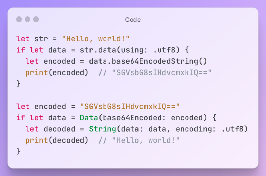
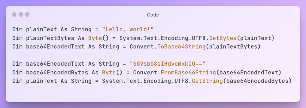
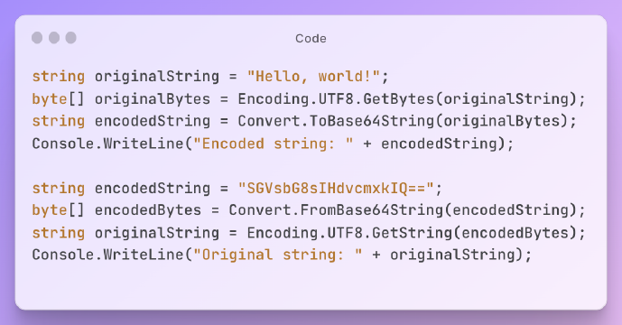
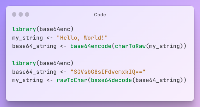
Using Base64 encoding
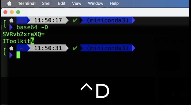
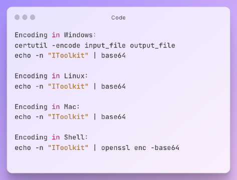
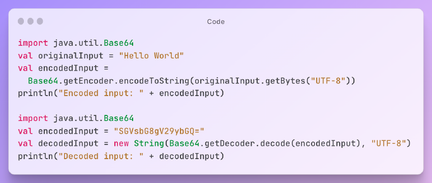
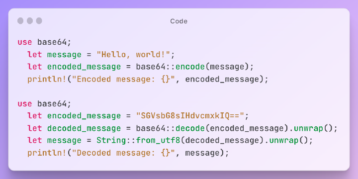
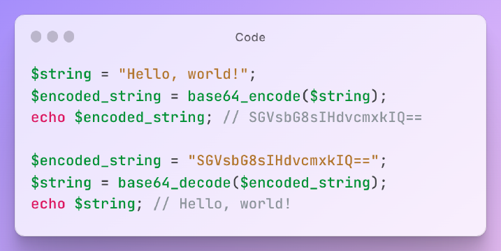
Base64 is a text encoding method that can embed image data directly into HTML or CSS code. It can be useful for very small images like icons and logos.
Some benefits:
- Removes separate HTTP requests as images are inline.
- Simplifies image handling as only HTML/CSS files are needed.
Drawbacks:
- Base64 strings significantly increase HTML/CSS file sizes.
- Not suitable for larger images or dynamic image loading.
Base64 works best for static, tiny images that need high availability. Applying it may look like:
1.logo {
2  background-image: url(data:image/svg+xml;base64,[base64 string here]);
3}
This inlines the logo SVG image into the CSS, avoiding an HTTP request. Use Base64 sparingly, as performance gains only apply to very small images.
Below I will recommend a free online verification tool for you, let’s experience it!
Utilizing image CDN services
Content Delivery Networks (CDNs) are networks of distributed servers that provide assets from locations closest to each user. This greatly speeds up resource loading - images load faster when served from a CDN edge location than the origin server.
Some popular image CDN services are:
- Imgix - Optimizes, caches and delivers images from worldwide POPs. Has smart cropping and resizing.
- Cloudinary - End-to-end image management from uploads to delivery. Includes manipulation and effects.
- Akamai Image Manager - Image performance solution with automated optimization and CDN delivery.
CDNs take care of caching, compression, resizing and format conversion. Using a CDN provides huge performance benefits for image loading on mobile. It also saves development overhead and reduces hosting costs.
Conclusion
Optimizing images is crucial for providing the best mobile user experience. Various techniques like compression, resizing, lazy loading and CDNs can effectively minimize image file sizes and speed up load times.
Responsive and adaptive images allow serving the most appropriate assets for the user’s device capabilities and network conditions. Fine-tuning image formats, sizes and delivery methods can make mobile pages really snap.
Concentrating efforts on image optimization improves key metrics like conversions, engagement and retention. It also makes sites more mobile-friendly from a development perspective. With the rise of mobile, delivering lightweight image assets is a must for modern web performance.

